What is OverTime all about?
OverTime is a brand that wants to see the best out of their customers. The definition of OverTime is: "Time in addition to what is normal, as time worked beyond one's scheduled working hours." Everyone has a day when they do a lot more than what they are used to doing, mainly students, business workers, employees, etc. Our tagline is: "We know you're working hard, let us help you stay on track!" Multitasking is a skill that we want to help you sharpen.


Why this Design?
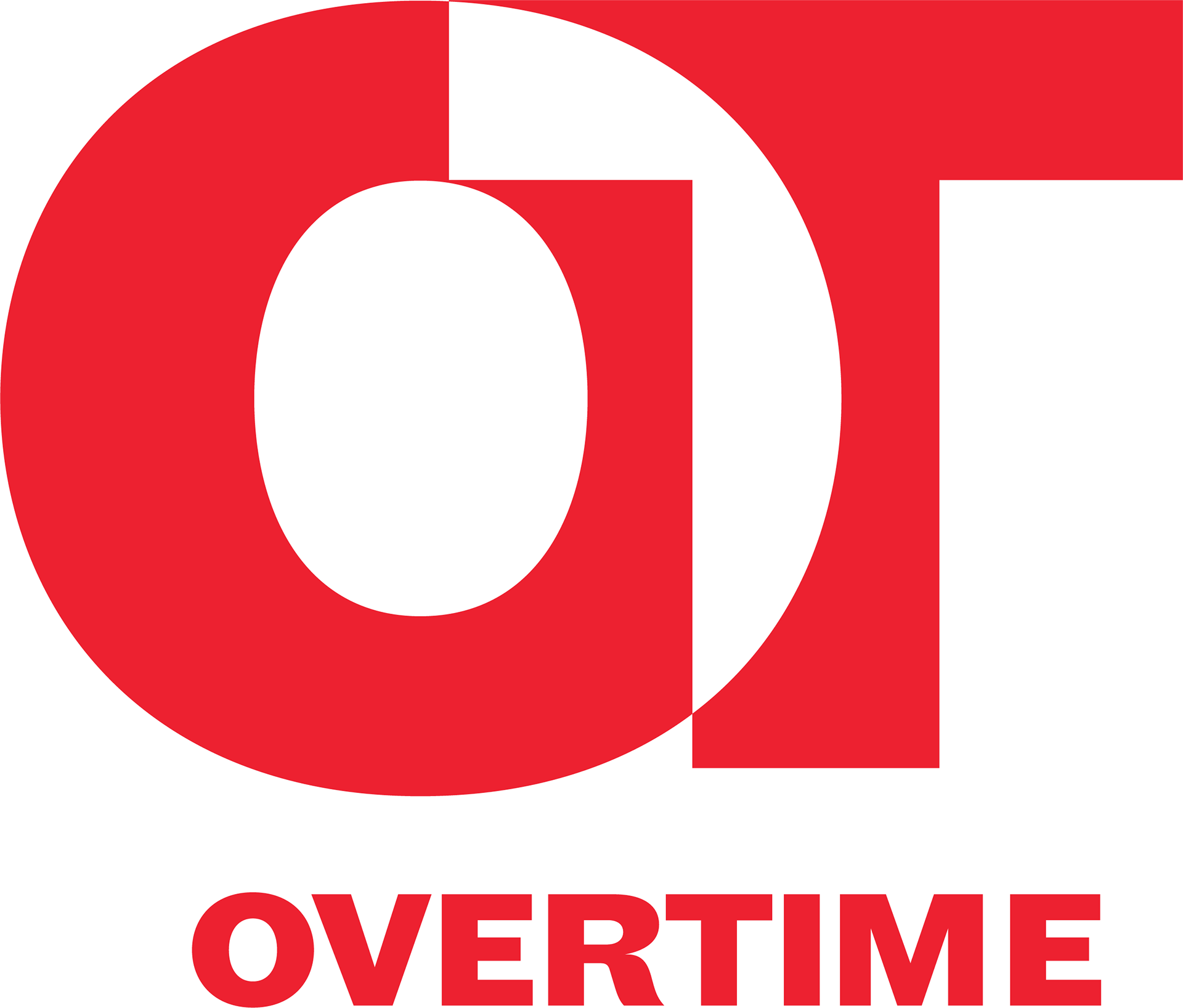
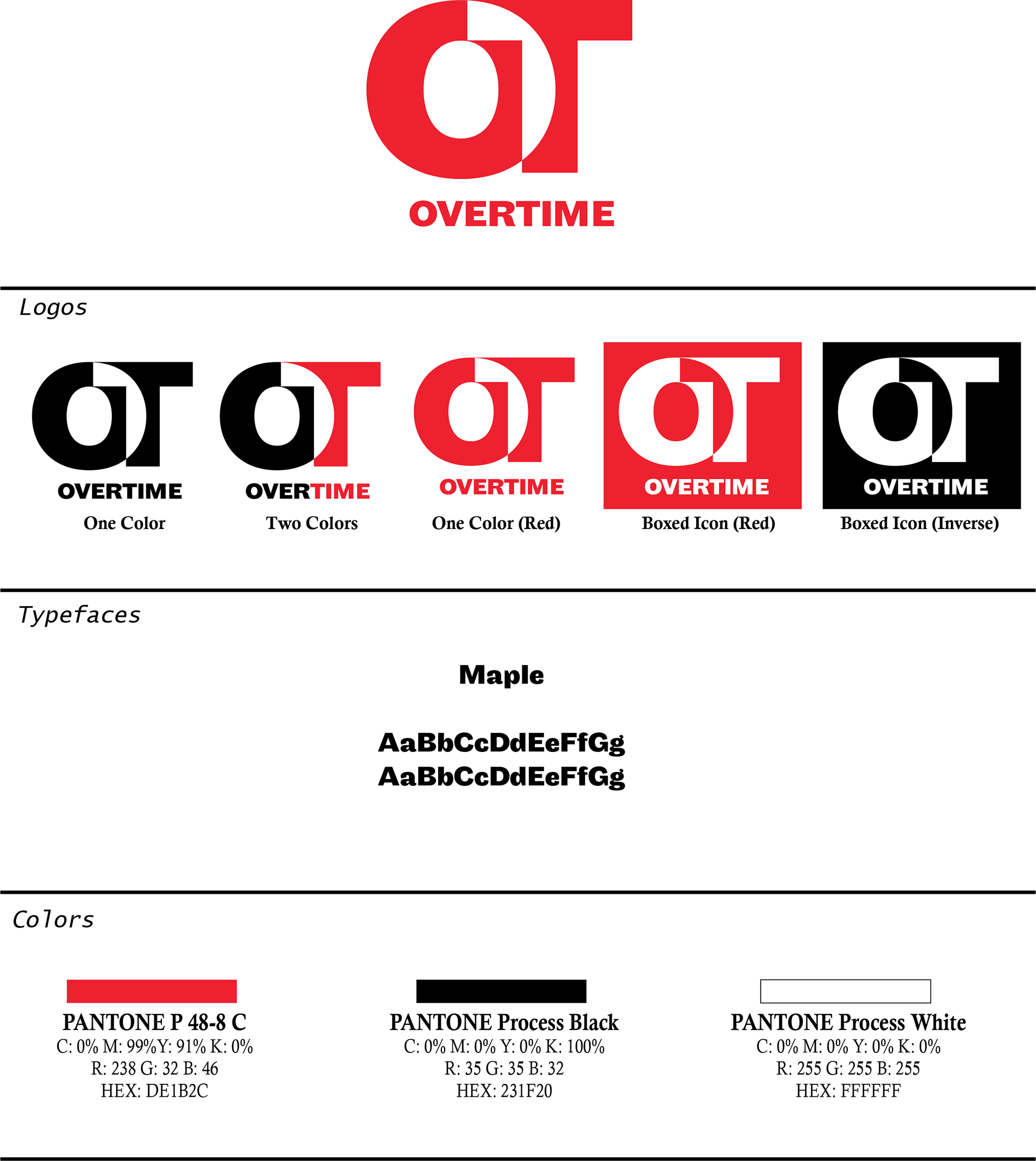
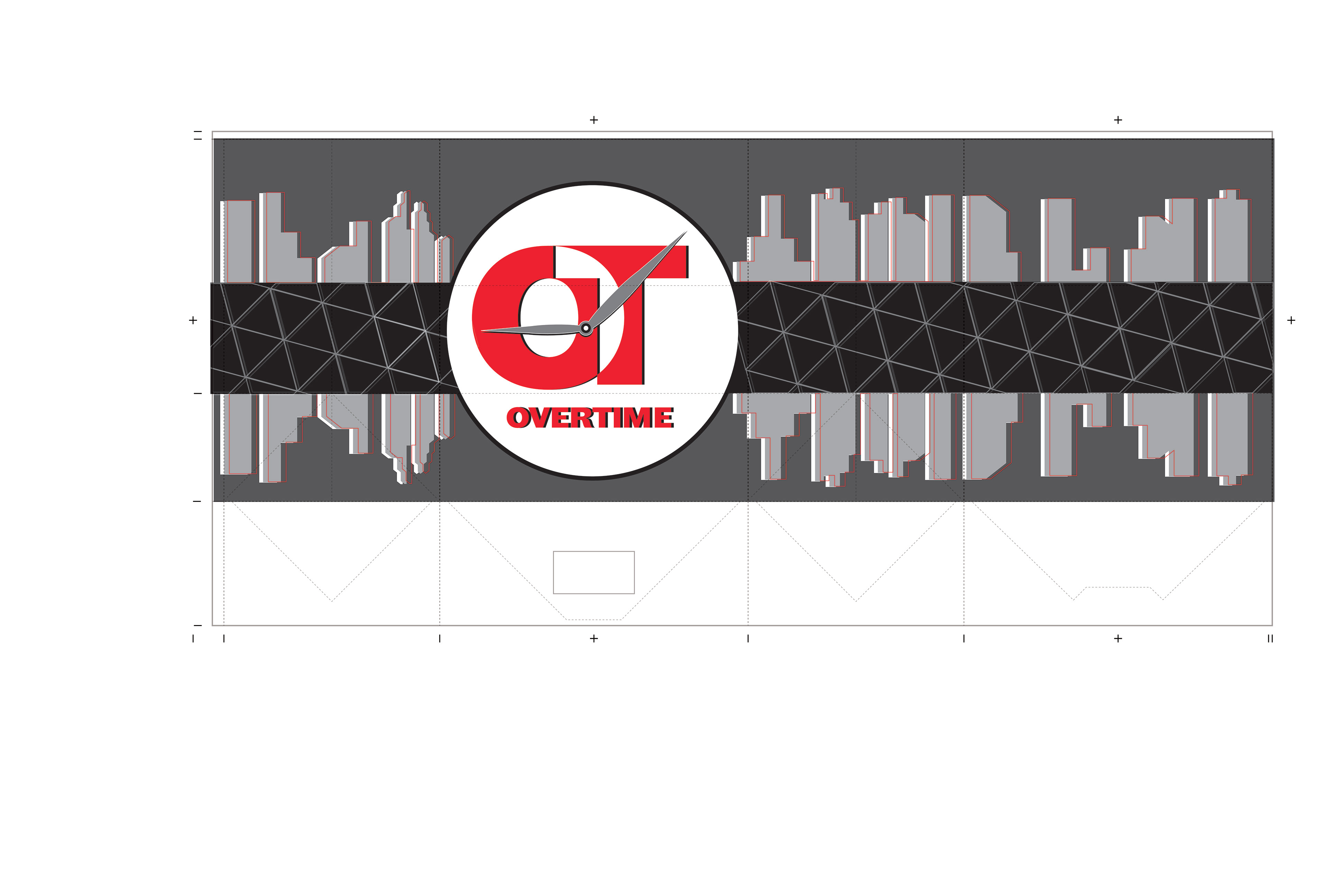
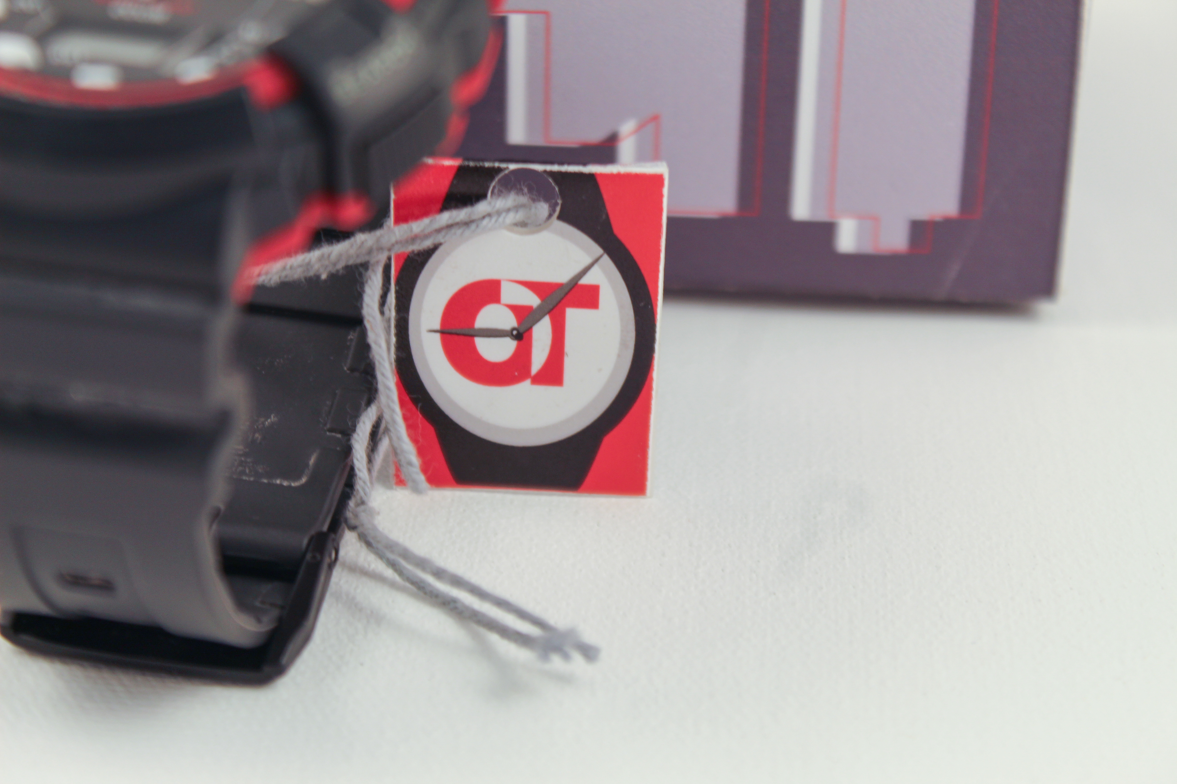
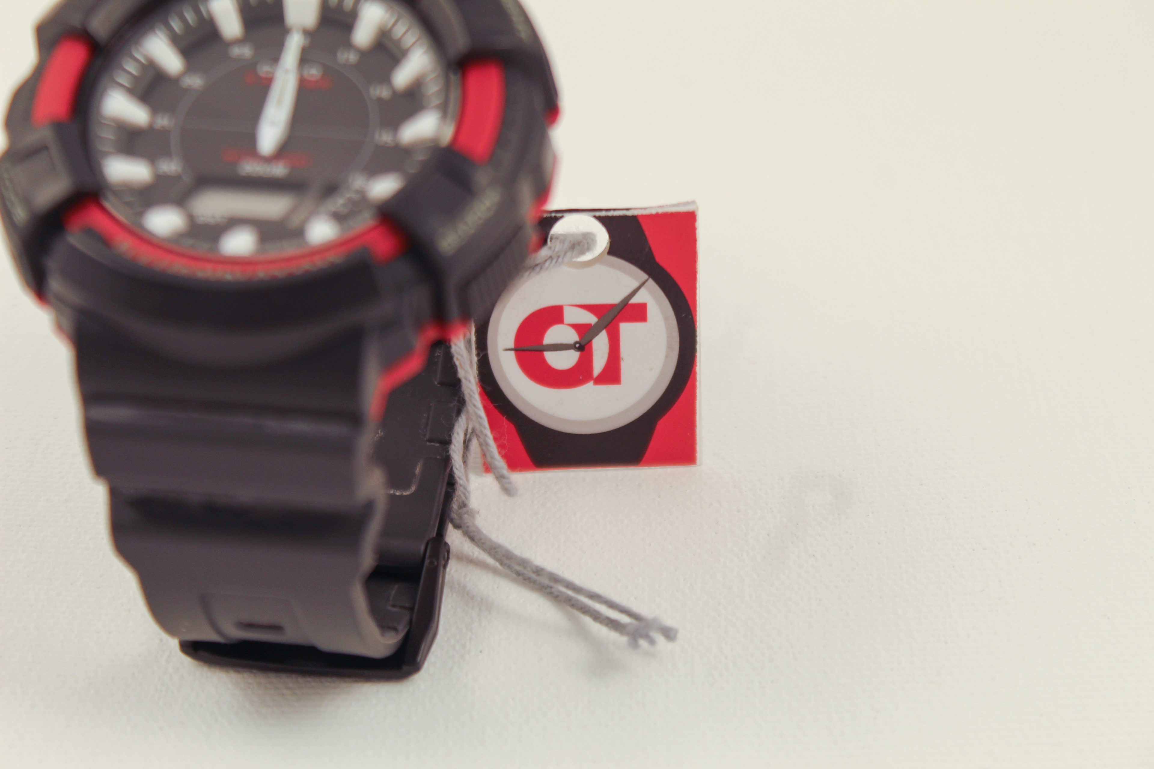
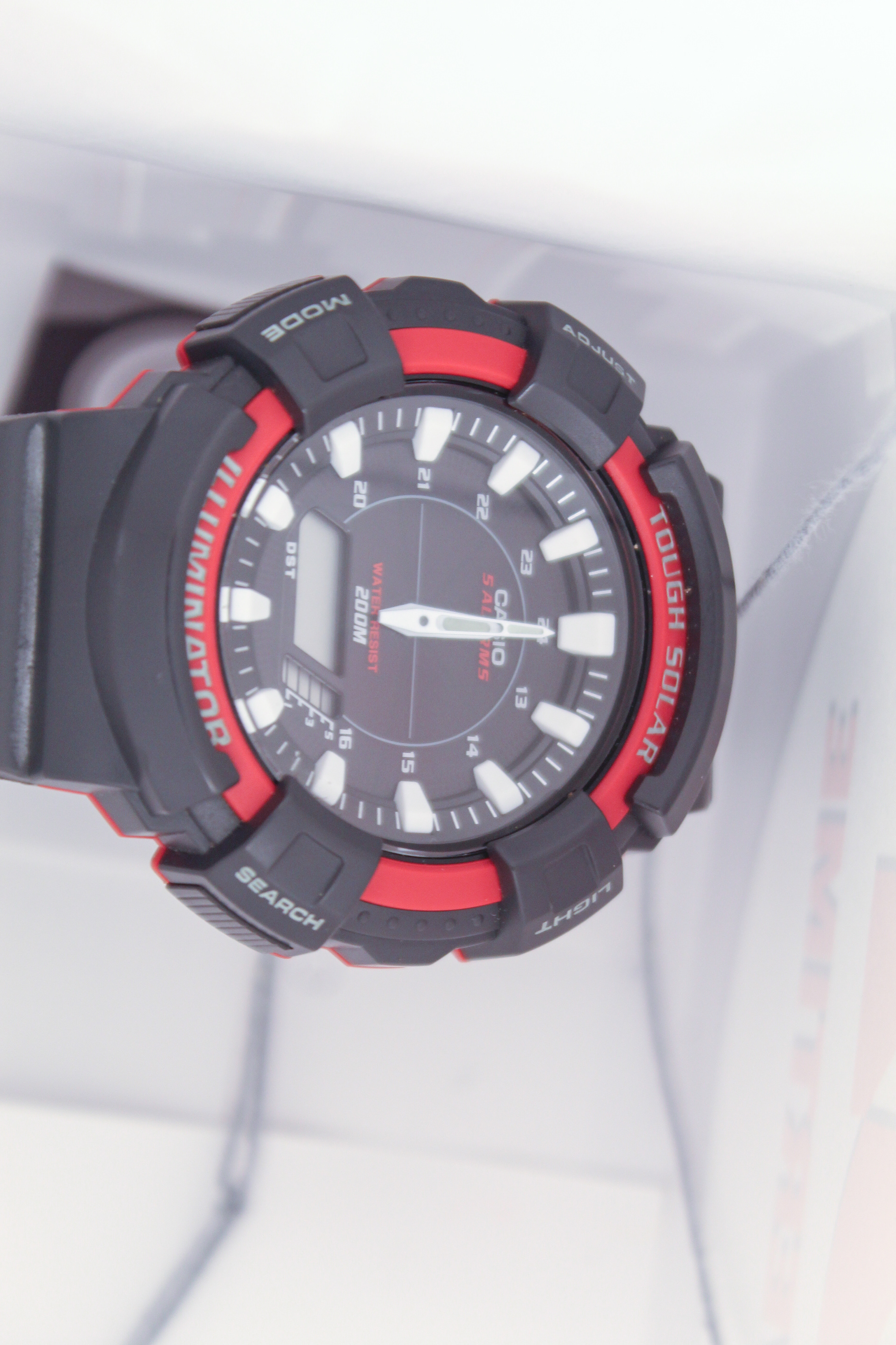
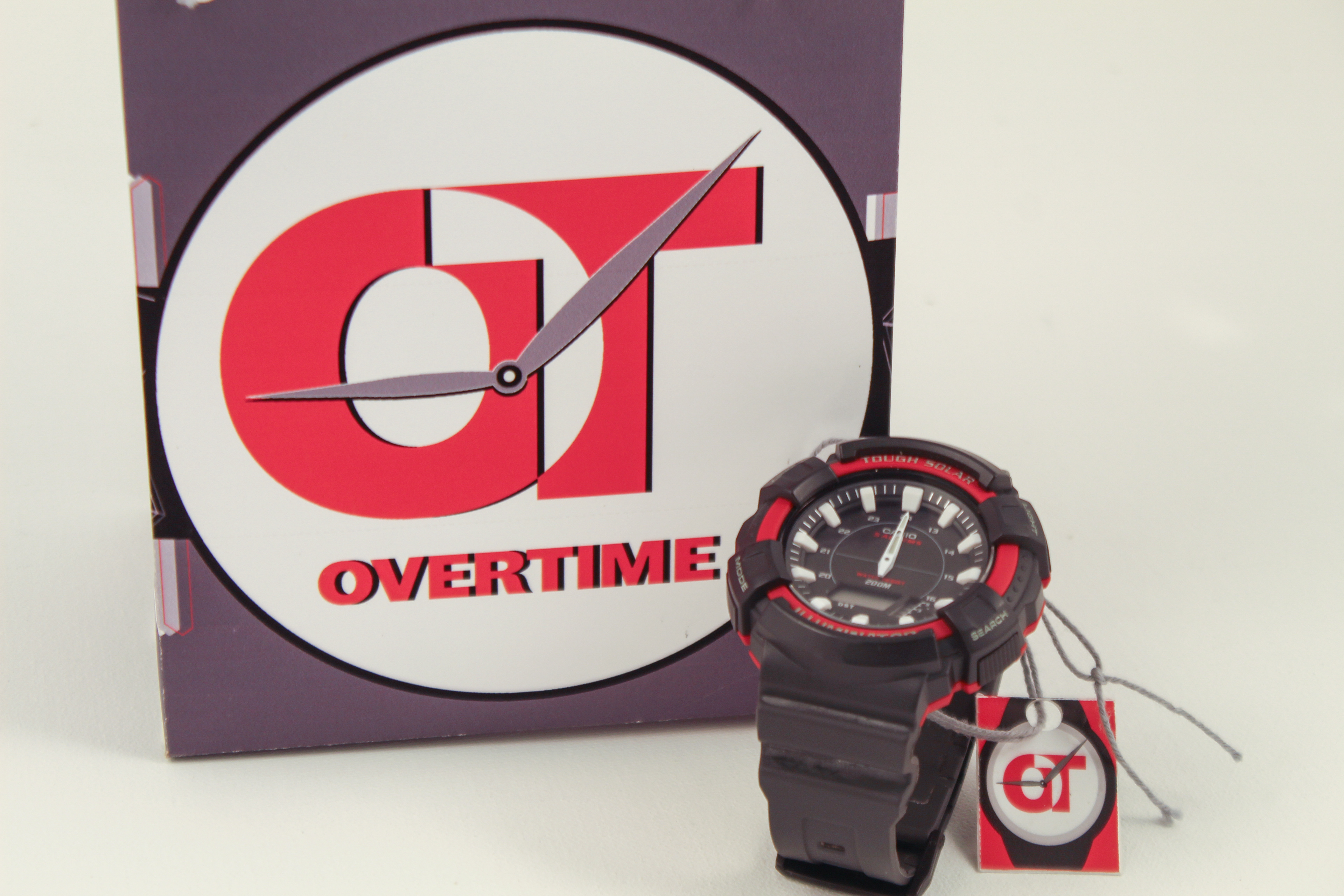
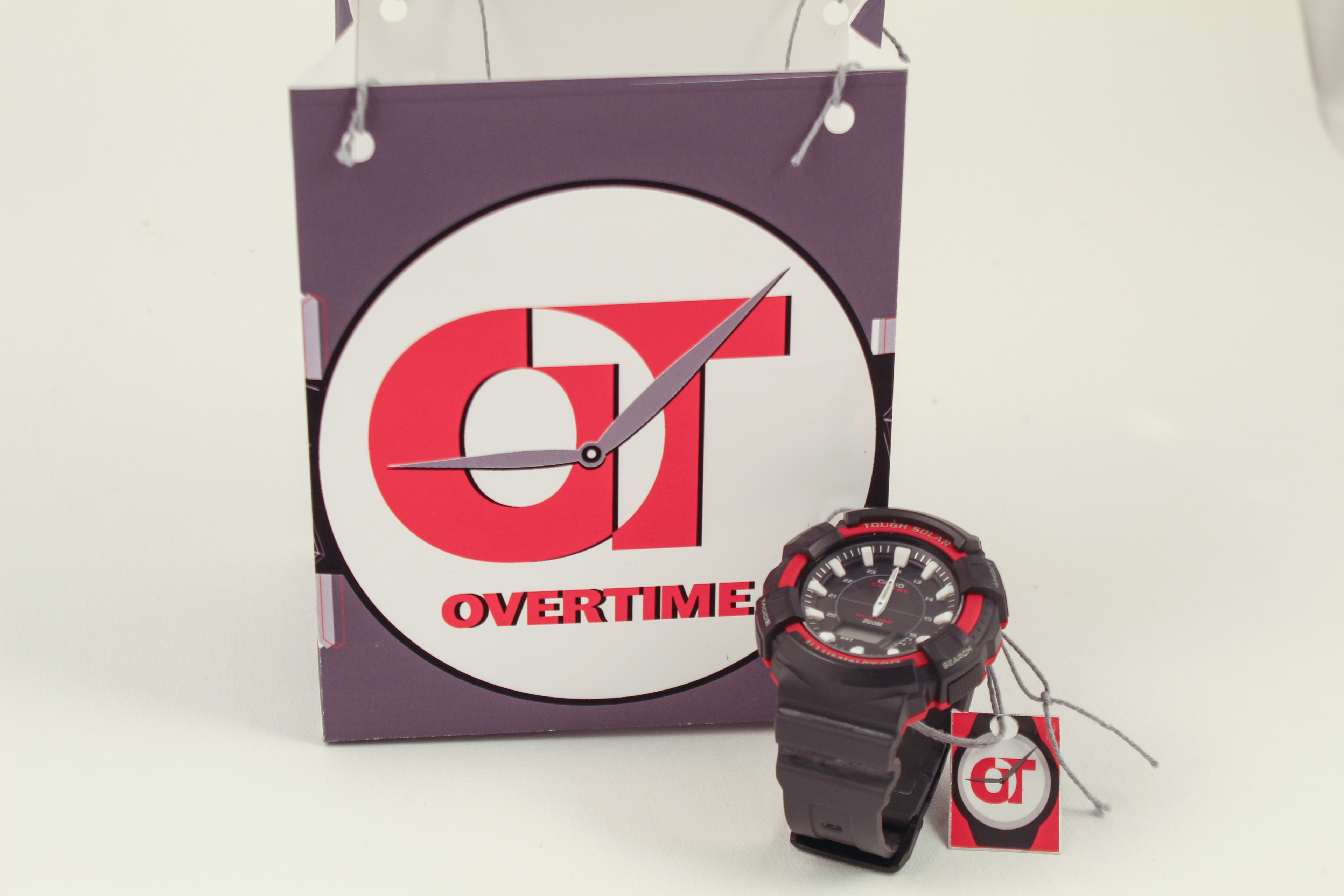
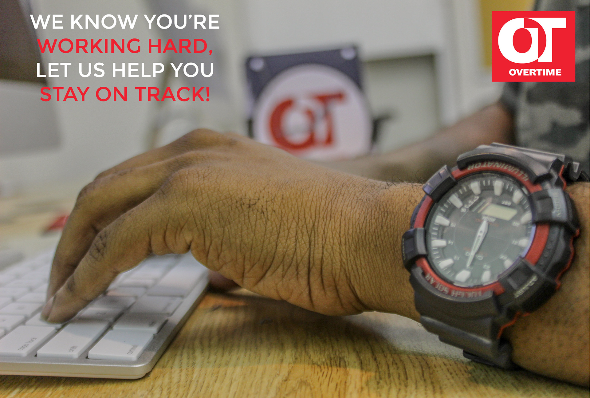
The Logo of OverTime are the letters: O and T. The letters are overlapping each other to represent the overlapping of a worker's busy schedule. The color red was chosen to be for the color of passion and determination. The design of the bag is based on a watch. The front of the bag represents a large face of a watch, the other sides of the bag are the wrist strap. The design above and below the wrist strap are a skyline of buildings which represents the usual environment that hard workers are usually in. The tag is also based on the face and back of a watch, with an "OverTime" imprint on the back.