What is Nature Valley all about?
Nature Valley is a brand that makes energy bars. They use natural resources such as whole grains, peanuts, almonds and nuts. There tagline "You can rely on us for real energy, wherever and whenever you need it." Meaning that they want to be reliable towards their customer whenever they are in need of energy. Nature Valley's target audience are for people who want to explore nature at the best of their ability. Nature Valley's end goal is that when you eat one of their products, they want you to feel natural.

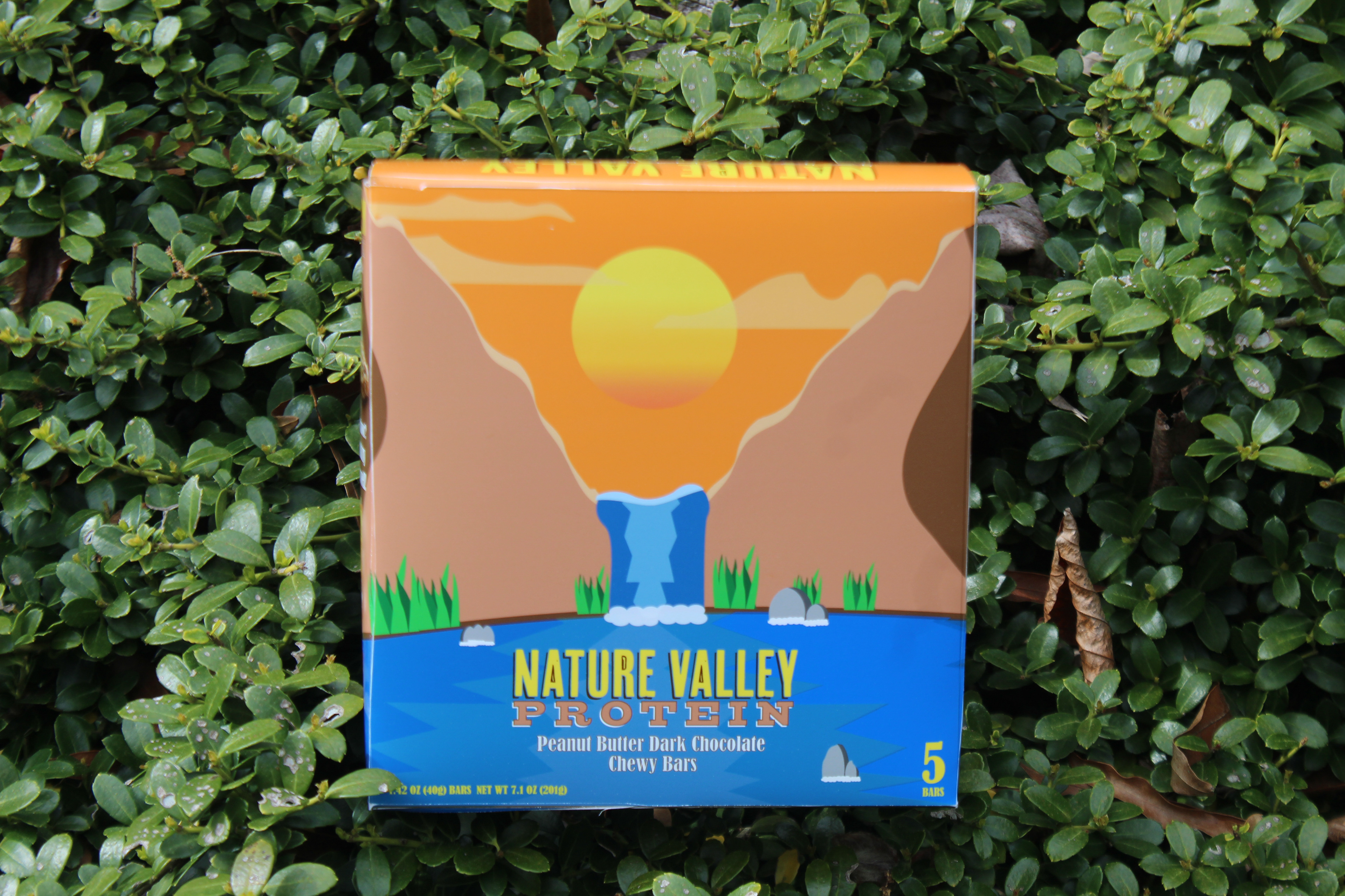
Why this Design?
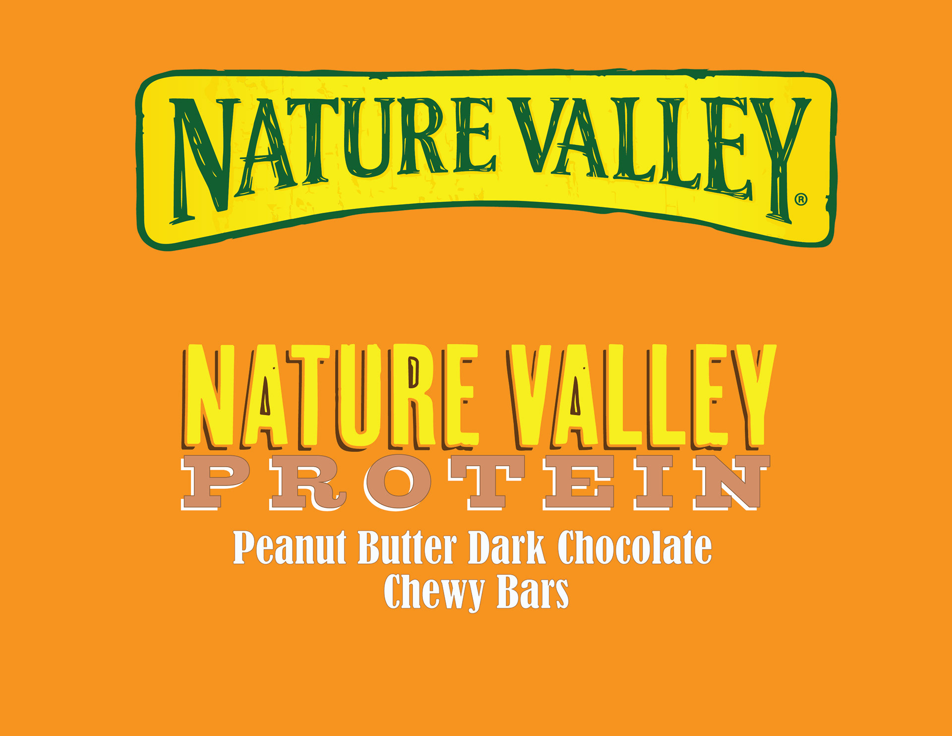
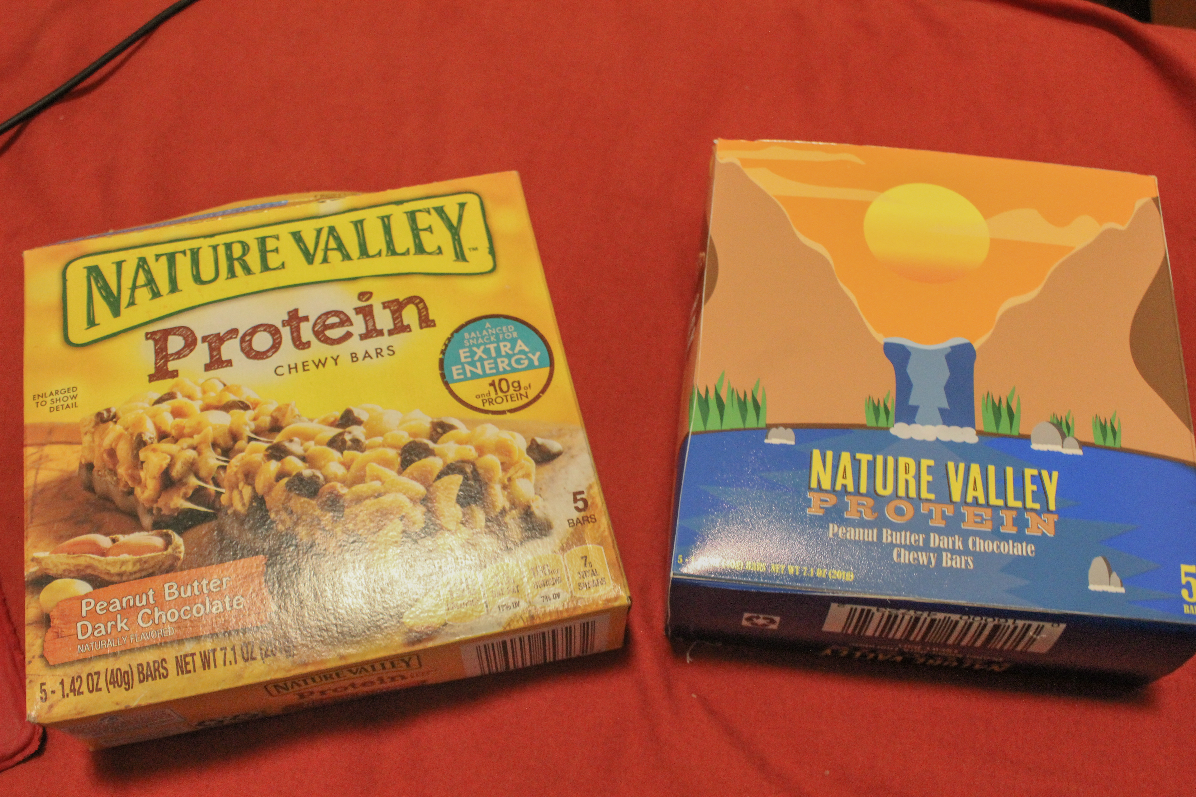
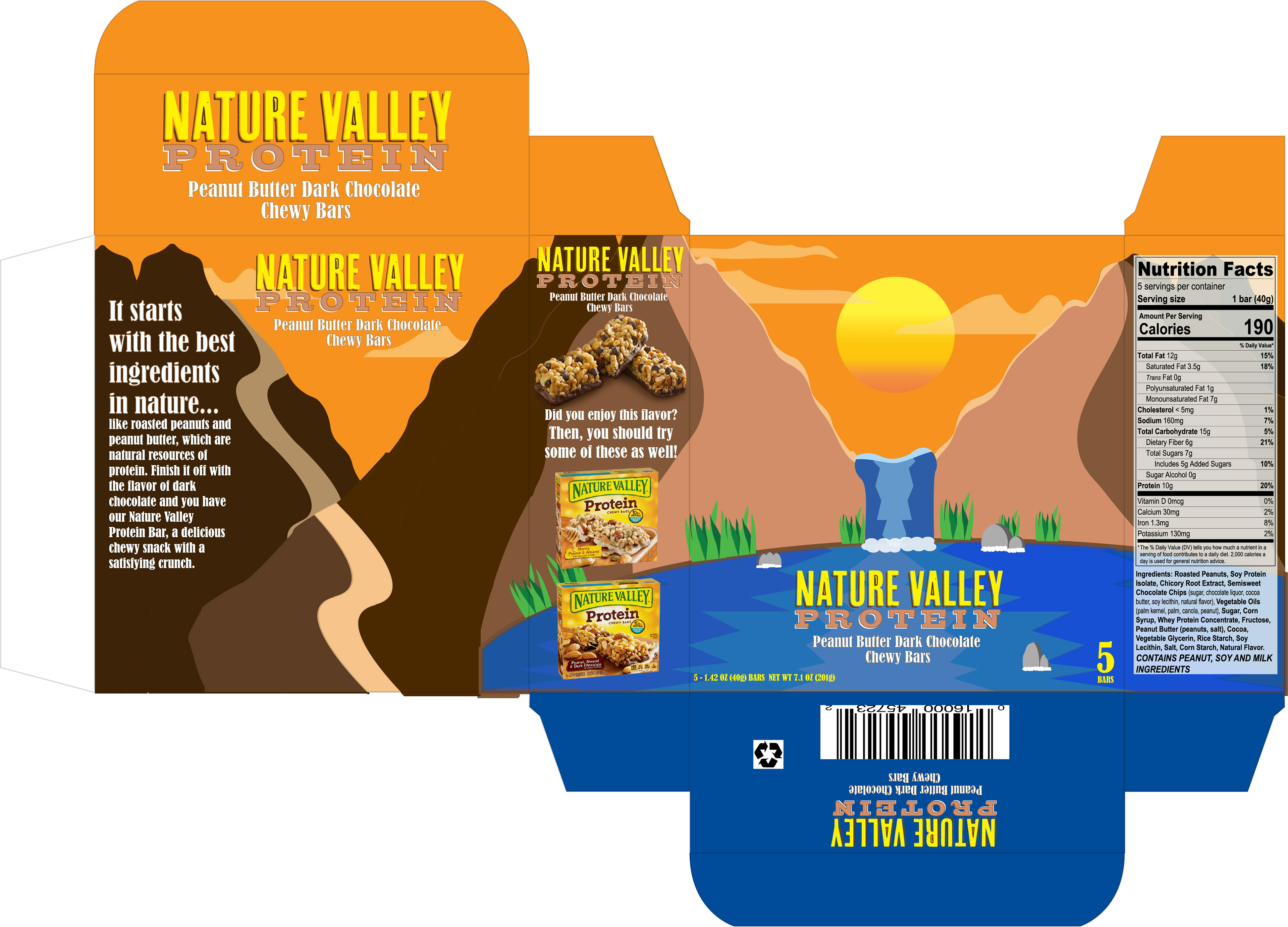
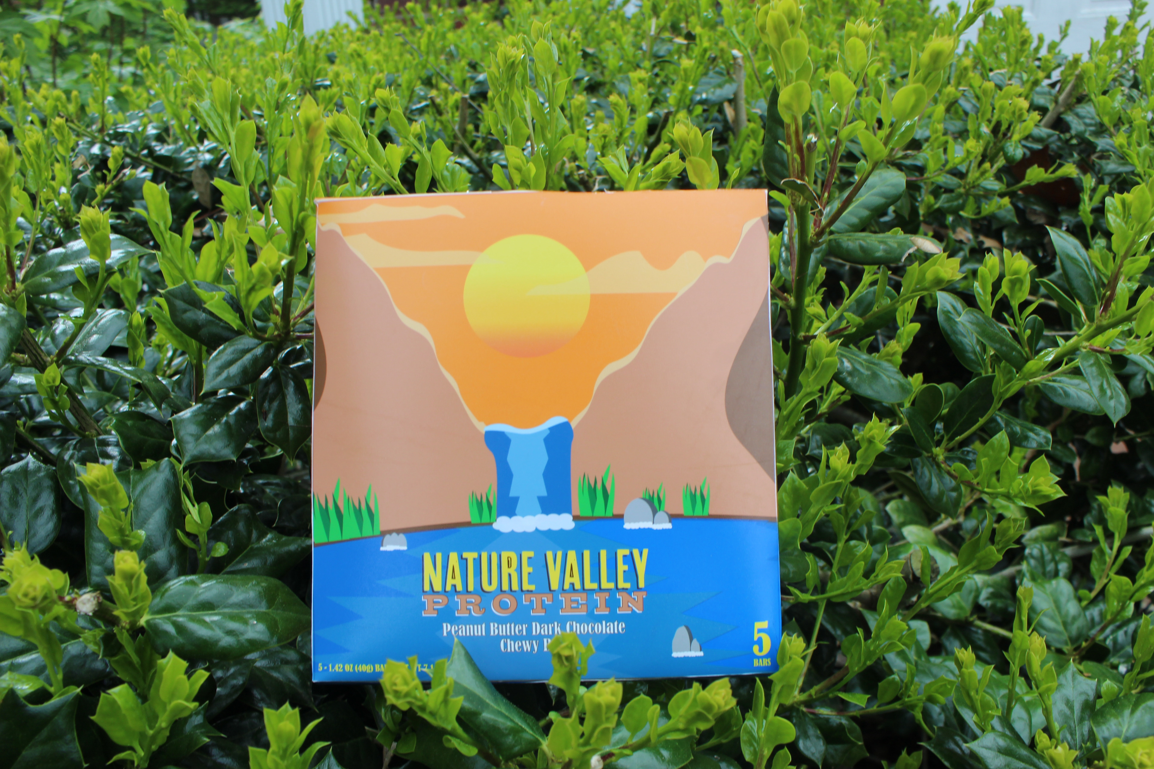
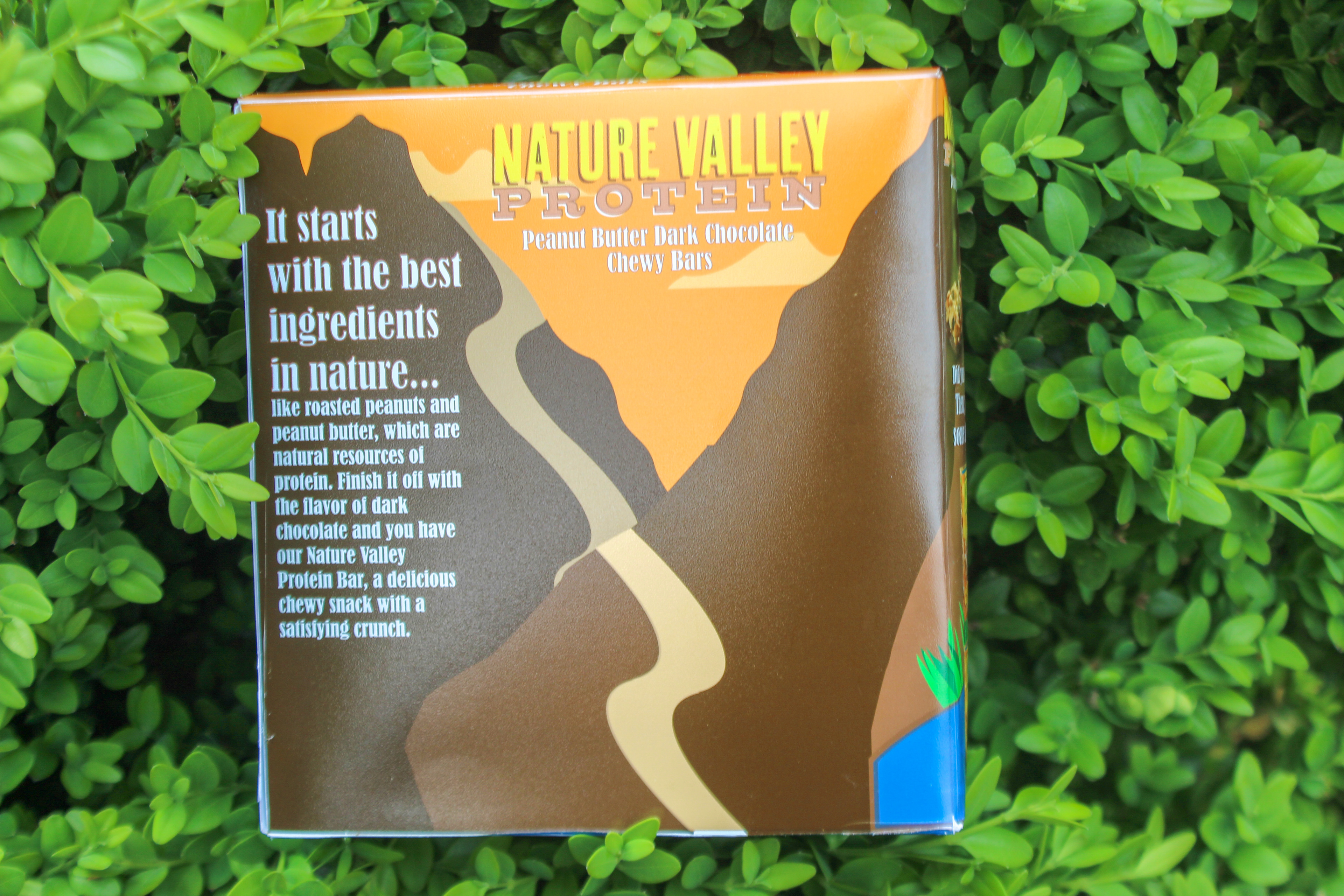
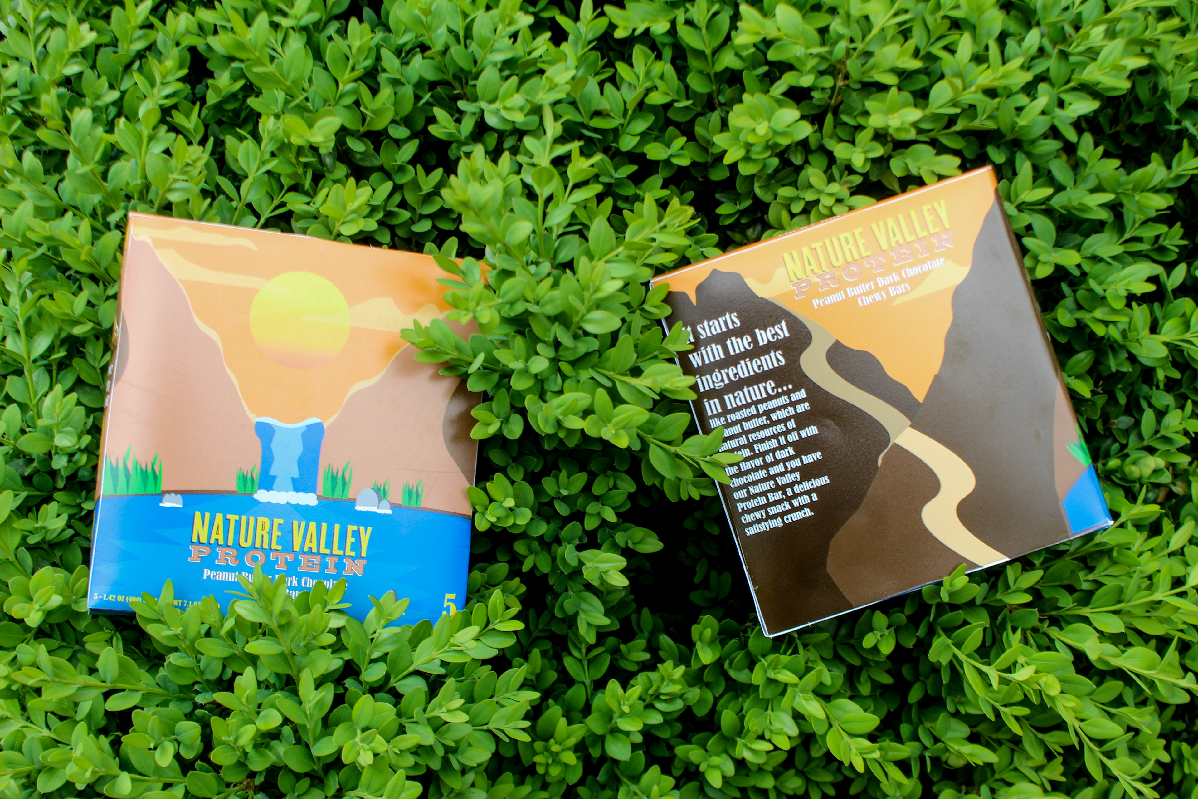
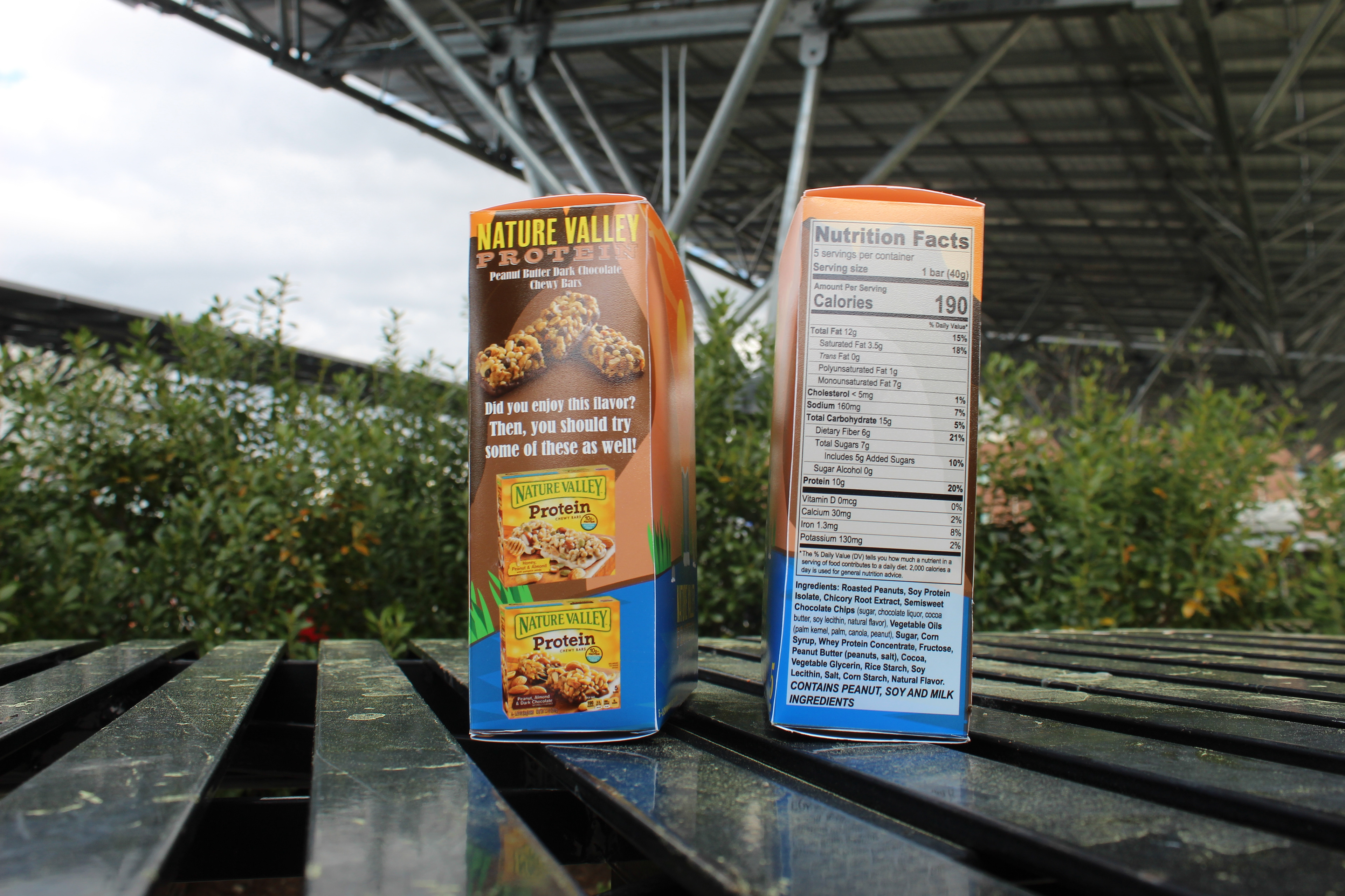
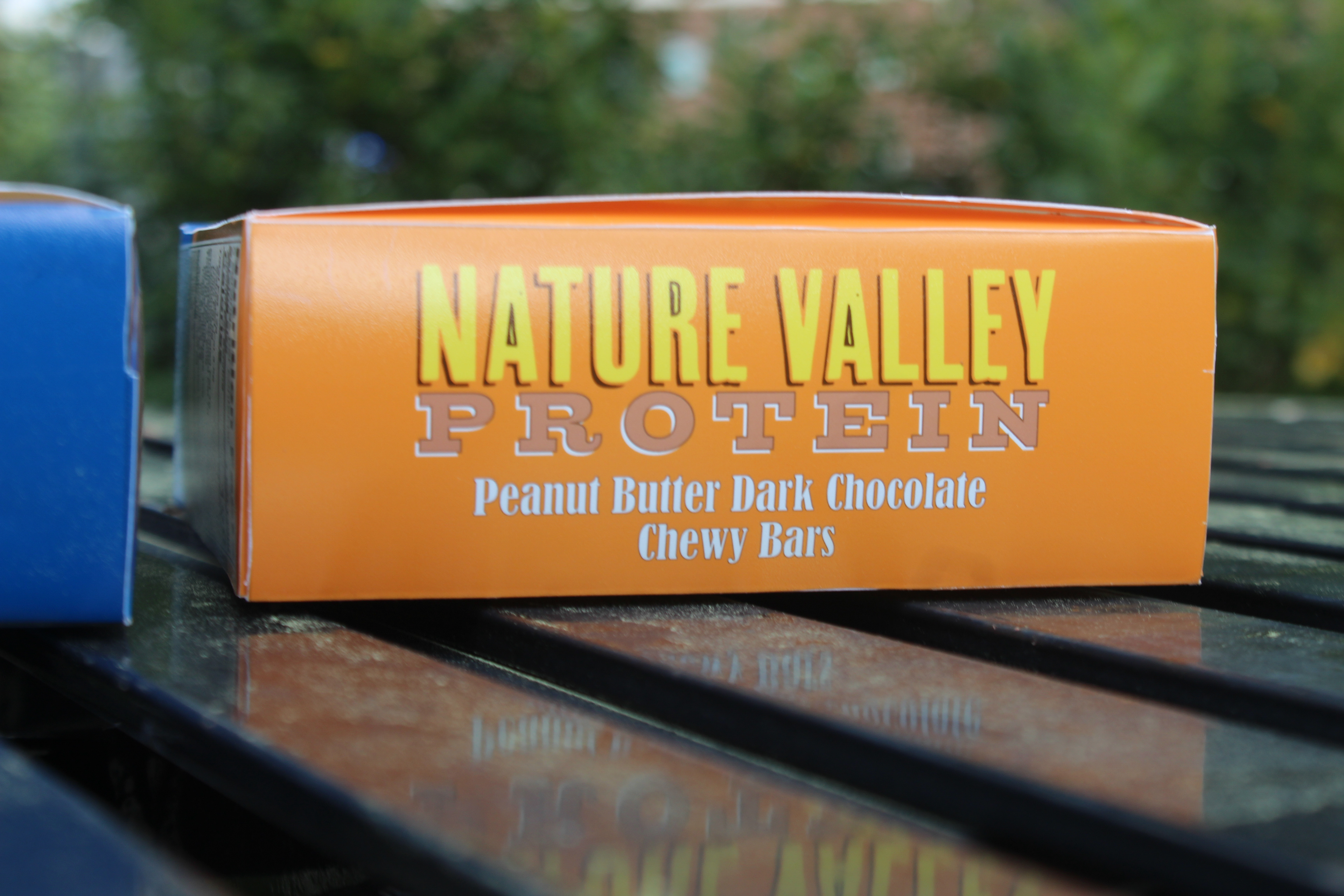
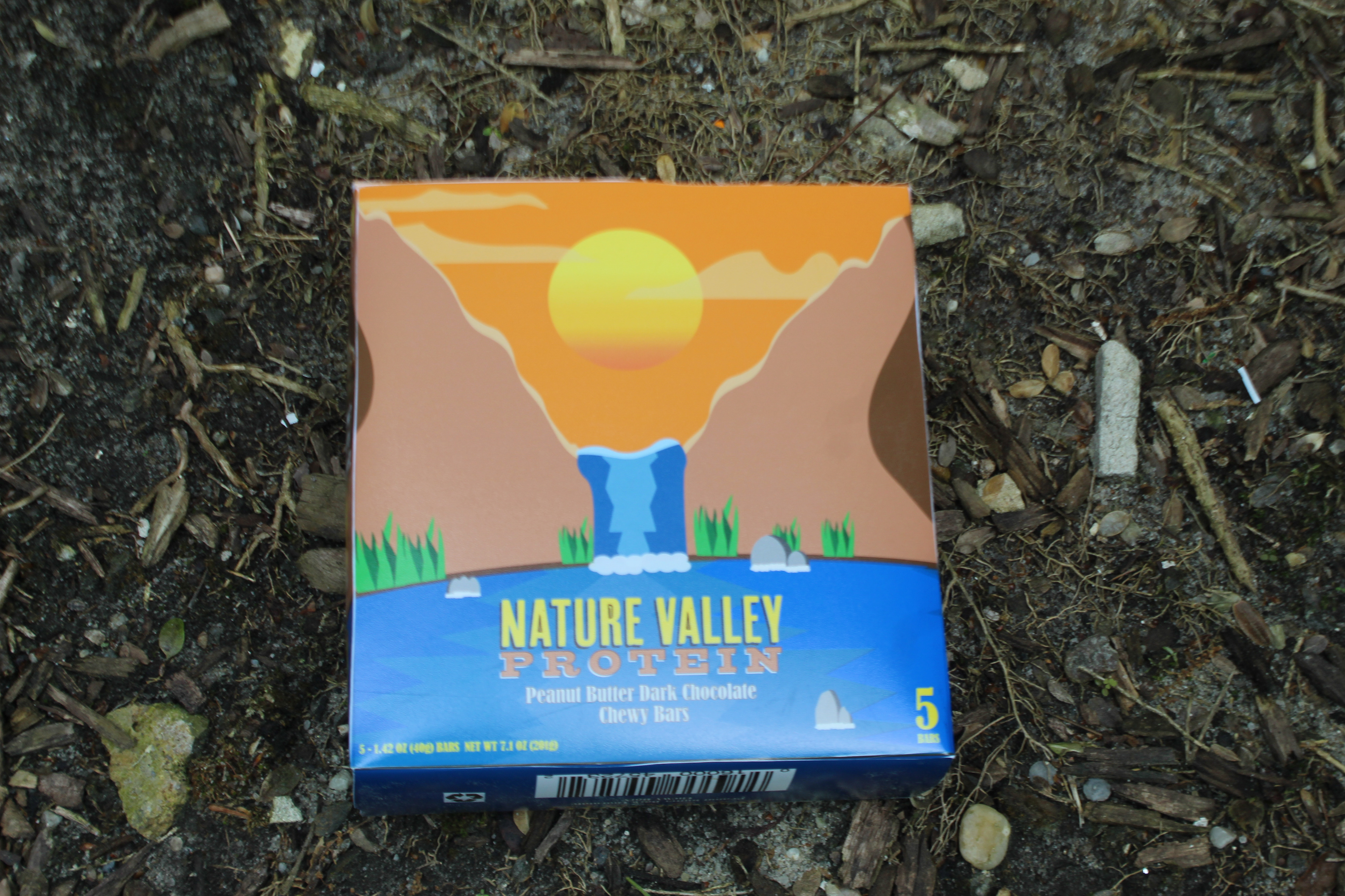
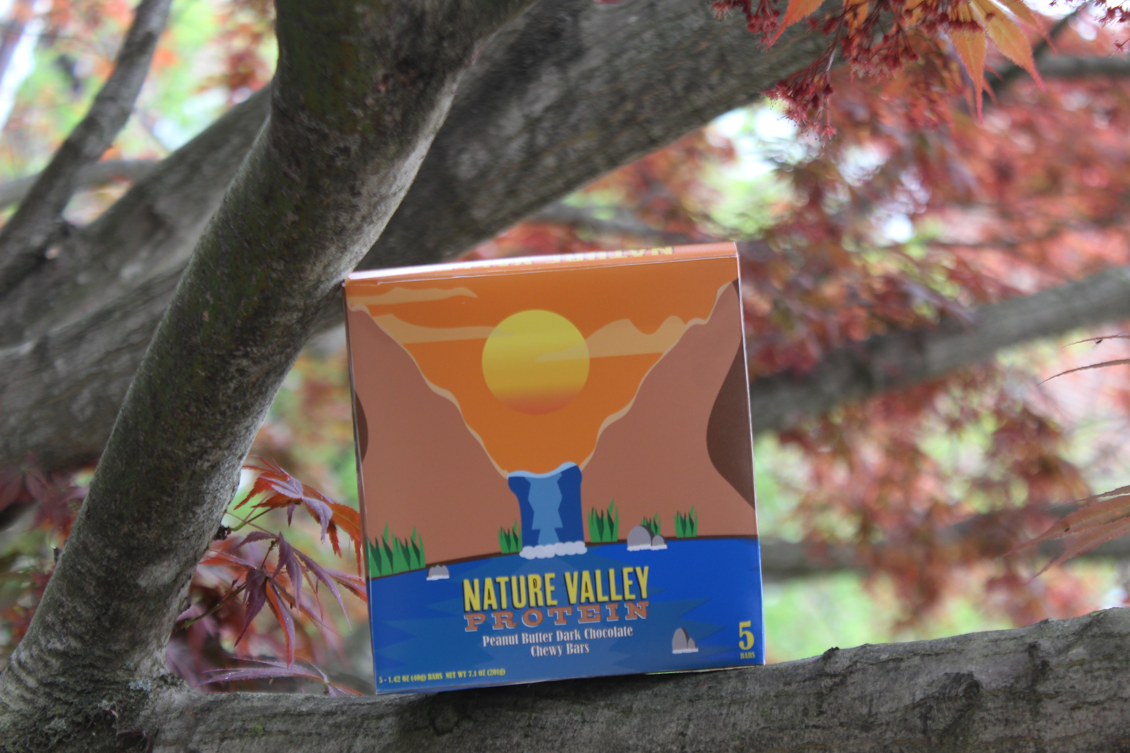
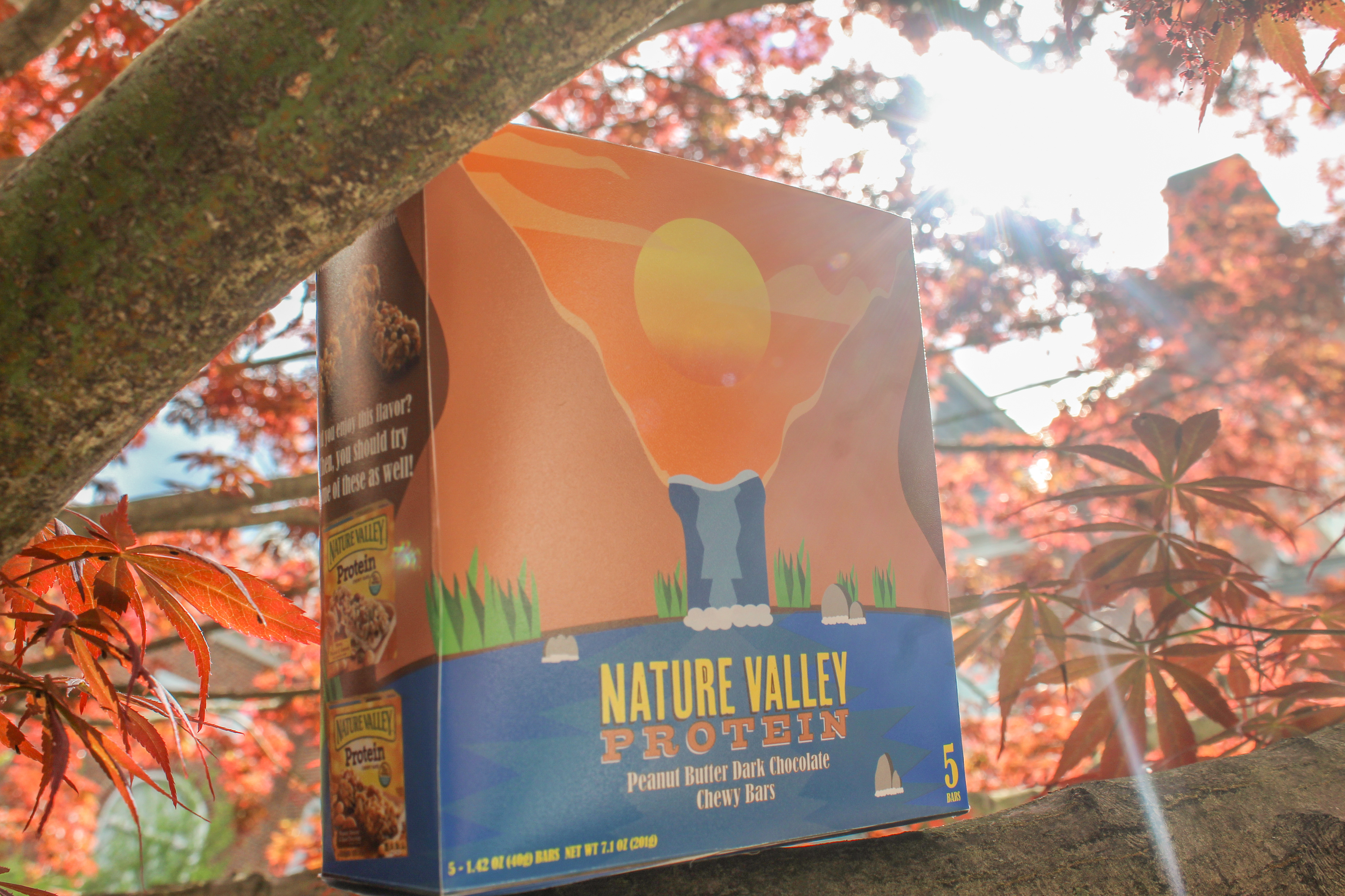
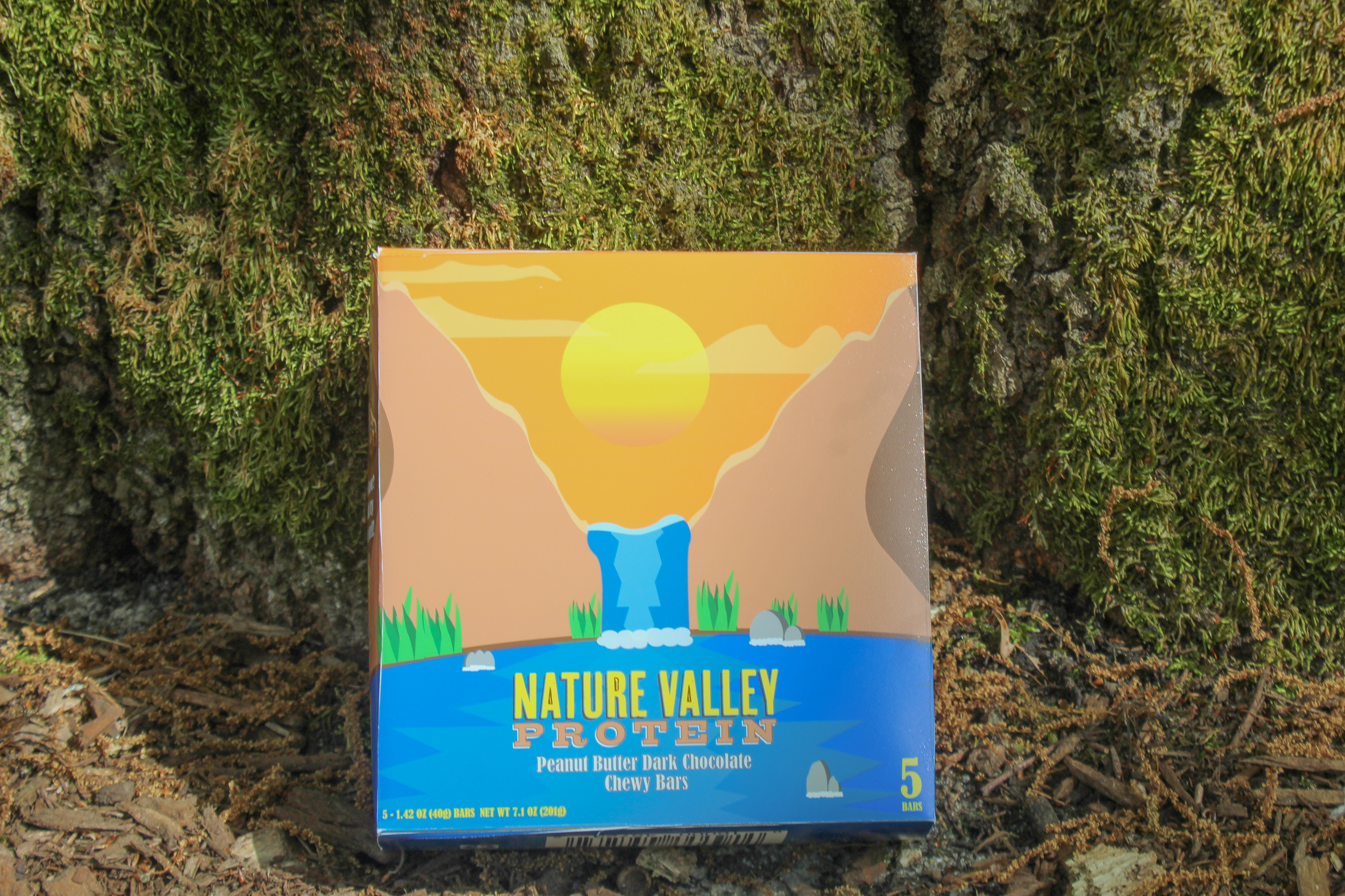
I decided to change the main colors of the logo to yellow and green, The yellow I chose was to symbolize as the sun, being bright and on top looking over the rest of the words in the logo. The sun is also used to give energy towards the growth of their products. I felt as if brown better described the natural ingredients that they use in the product such as nuts, almonds, or cashews. The brown could also represent the same color as the soil used to grow their products. For the background, I went with a simple nature based background where the sun is peaking over the mountains. The mountains are representing the flavors of this protein bar in particular, Peanut butter and dark chocolate. The orange sky is used to describe when people usually start their day and begin to build energy overtime, similar to how plants do during photosynthesis. On the back of the box design, there is a trail leading towards the back of the other mountain. This trail is to resemble the goal of wanting to restore 10,000 trails throughout the US. The original box design had a tab that did not allow easy access to the bars, so I decided to make the space inside the box a bit bigger, and used a large tab to cover the top and bottom of the box.